Iterating level design - Part 1

So, for the last Ludum Dare contest I used parts of the code from my 2.5d platformer seen below (the code to turn the camera around corners), and during 48 hours I tried to make a decent game out of it.
The game felt like it was really, really great for the first one and a half day, until I started implementing the levels (late as usual). Then it quickly fell apart as a very linear, and actually quite boring experience!
This is something I’ve felt before. That the level design becomes my weak spot. So what do you do with your weak spots? You try to make them go away. With practice and hard work. It might also help with a lot of patience, curiosity, study and the help of good friends!
So here comes part 1 of my re-implementation of that game!
(Links are in the bottom of the post)
This are the thought on my first re-iteration:
- Start over from scratch, keep the boss and the initial trigger but scrap everything else and start clean
- Divide the level into smaller “rooms” instead of just a huge open world
- Each room should have a start, and a clear exit
- The exit is initially “locked”. You need to “unlock” it to proceed, thus always giving you a new goal to strive towards
- Each room should have a specific challenge, and should let you learn something new
New features:
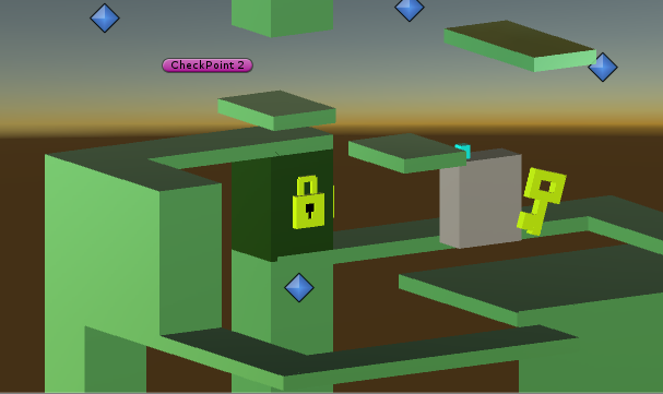
- Added a padlock-object to mark the exit in each “room”
- Added a key-object which is needed to unlock the exit
- A new script that can trigger a sequence of blocks to move along the y-axis. Is used when unlocking the exit block, but could also be used to raise a staircase or move parts of the existing level
- A new type of node that can switch the rotation instantly. Used to go from -360 to 0 degrees, and thereby letting you move in circles. Something that wasn’t done in the original entry
- The camera is now at a smaller angle from the player, which makes sure you get a better field of view when moving in the opposite direction (a huge problem in my Compo-version). Also moved the camera back a bit
Known bugs:
- The player can only jump if standing on the ground, and the ground check is only done in the middle of the body. If you are standing close to the edge it might decide that you are actually not grounded…
- The edge-turning script bugs out if you move left-right close to it…
The result of iteraion 1! Unity Web Player Windows build OSX build My original Ludum Dare 32-entry can be seen here!
The good:
- Even though I only finished three rooms (and no battle mechanics yet), I believe this is an improved version over the compo-version. Moving in the right direction at least
- Most of the features worked out really well! The rooms and the locks.
However, it’s not nearly good enough! The bad:
- I spent probably 5-6 hours (fully focused) on the new level design. That’s way to slow for only three rooms, and the quality is not near good enough!
- The introduction does not feel good at all. Where is the path taking you? Straight to the boss?? Nothing more? No anticipation?
- Each rooms need to be more compact. I actually did a second pass and narrowed them down before this post.
- The rooms are laid out in a downward spiral. Since the camera is angled downward you’ll spoil a lot of future events (as the enemy encounter). The rooms should instead be laid out in an upward spiral. I know from the 2.5d demo that this also can give you a really awesome sensation of vertigo, and will let you see all the passages you already cleared but hiding whats to come.
